TSF UrbaNature
A Geneva nature NGO’s WordPress site, rebuilt from scratch: real projects, verified figures, three languages and a clear way in for every visitor.
- languages
- 1 → 3
- French only, now French, English and German
- project case studies, each with verified figures
- 5
- The old homepage showed none
- script files loaded by the homepage
- 40 → 1
- Counted from the saved old homepage and the live new one
- Lighthouse performance score, desktop
- 99
- 100 for SEO and best practices, 96 for accessibility. 24 Sep 2026
What wasn’t working
TSF UrbaNature plants micro-forests, green roofs and edible gardens across Geneva. Its old website showed none of it. It was a French-only WordPress theme: a mosaic of tiles with vague labels, a menu hidden behind an icon, and not one finished project on the homepage. For an NGO that needs schools, councils and funders to trust it, the site was working against the work.
A menu you had to go looking for
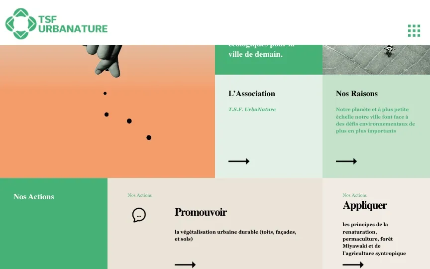
On a desktop screen, all the navigation sat behind one small grid icon. First-time visitors couldn’t see what pages existed.
Pale green on pale green
The sentences meant to explain TSF were set in small green serif type on mint tiles, the hardest text on the page to read.
Arrows that don’t say where they go
Row after row of bare arrows with no link text. The only way to find out where one led was to click it.
“Nos Actions”, seven times
The same label sat on the section tile and on every card under it, so the page repeated itself instead of explaining anything.
One button for everyone
“Rejoignez-nous” was the only call to action. A school, a council, a company and a volunteer all got the same vague invitation.
The proof was hidden
News, press and testimonials were three headings with an arrow each. Not one finished project or figure made it onto the homepage.
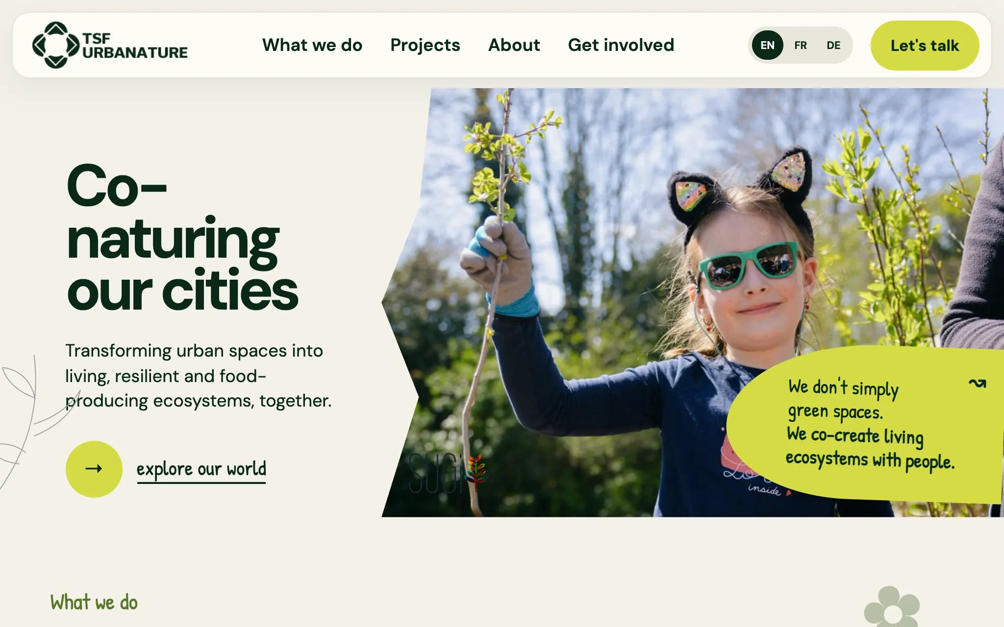
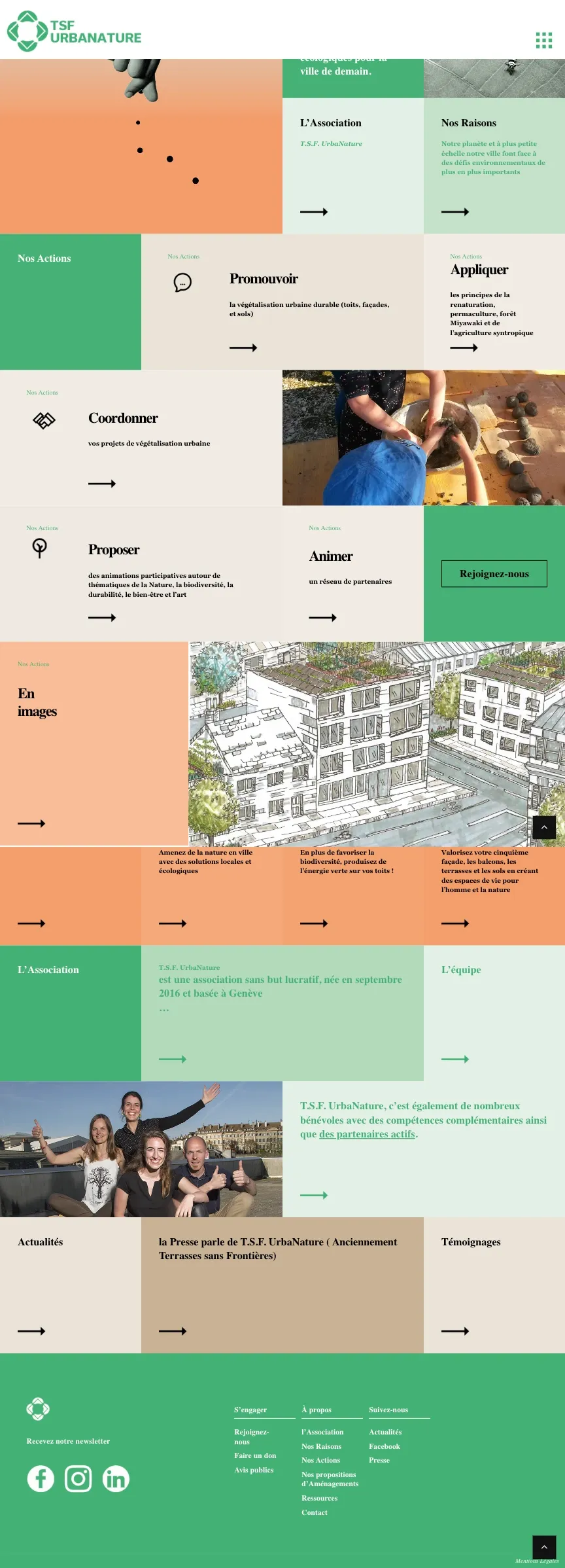
Both homepages, side by side
Scroll either page and the other follows. The new one is longer, because every section now has a job to do.
Before
- A mission statement and a slogan
- L’Association and Nos Raisons: a heading and an arrow each
- Nos Actions, then five verbs: promote, apply, coordinate, propose, lead
- Rejoignez-nous
- En images: a single illustration
- Three short pitches with no headings
- L’Association again, then the team and partners
- News, press and testimonials: headings only
After

- What TSF does, in one line, with a real photo
- Five services, each with a photo
- The approach: renature, participate, inspire
- Four ways in: a space, funding, a team or a partnership
- Latest projects, with figures and status
- From nursery to ecosystem, in six steps
- Ambitions, clearly labelled as future goals
- Partners, awards and what partners say
- Donations, who TSF is, and a closing call to action
The decisions that mattered most
We started with the people TSF has to convince (landowners, funders, companies and partners) and what each of them needs to see before getting in touch. That gave the site its shape: what TSF does, proof that it has done it, and a clear next step for each kind of visitor. Then we built it as a fast static site in three languages, with every figure checked against TSF’s own reports.
Navigation you can see
- Before
- Every page hidden behind a grid icon, and all of it in French.
- After
- Four sections in plain view, a switch between French, English and German, and one obvious “Let’s talk” button.
Before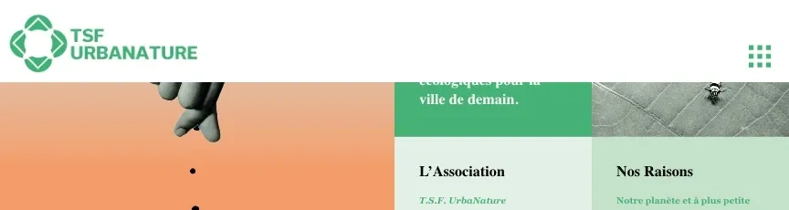 After
After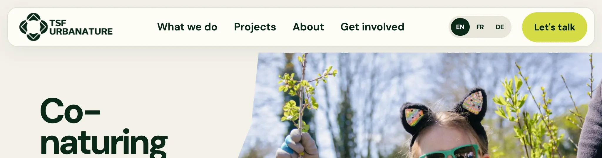
Proof instead of verbs
- Before
- Promote, apply, coordinate, propose, lead: five verbs and not one example of TSF doing them.
- After
- A projects page where every entry is real, marked Completed, Ongoing or Planned, and shown with the figures TSF can back up.
Before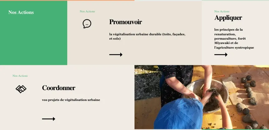 After
After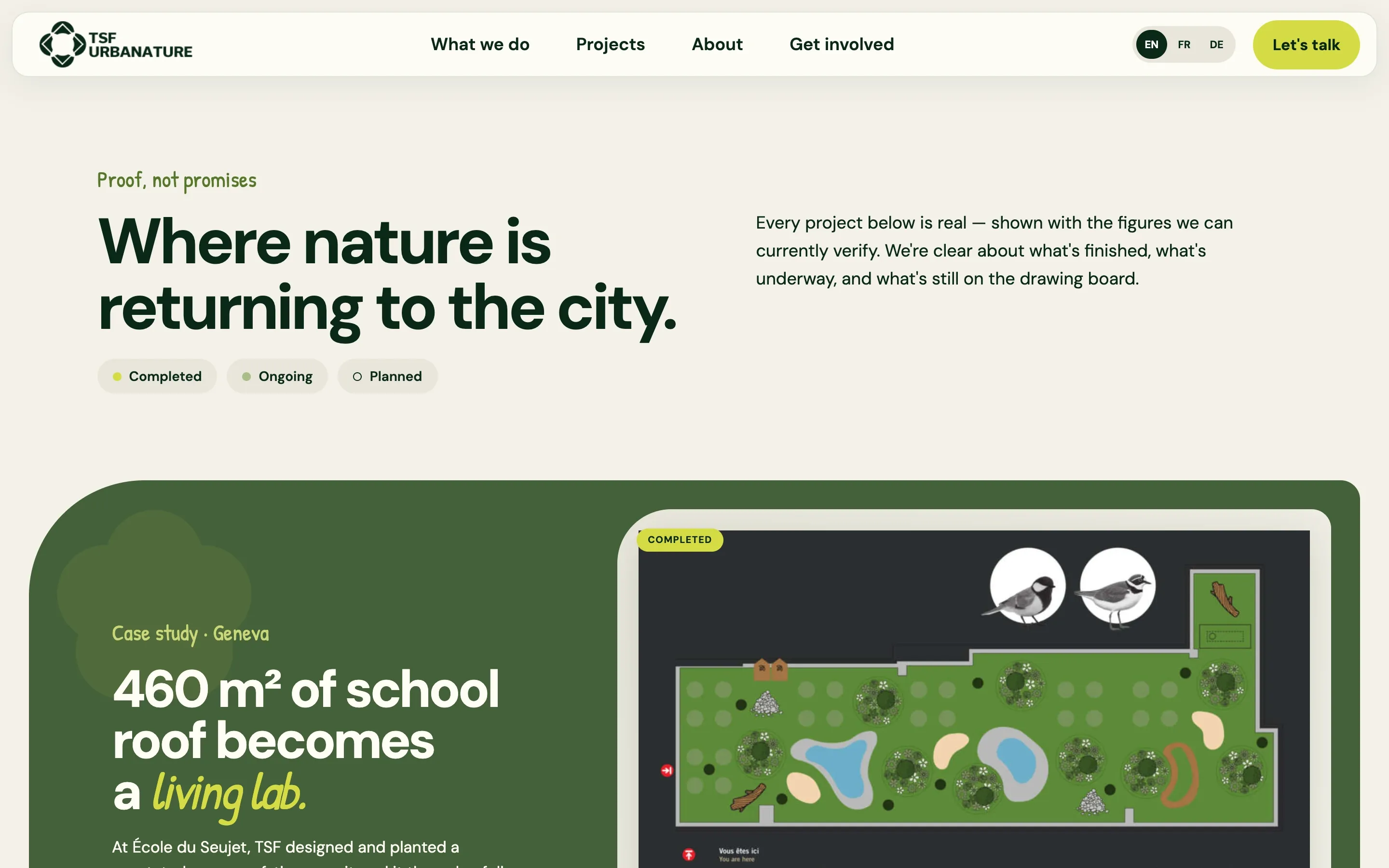
Numbers you can trust
- Before
- No figures anywhere on the old homepage.
- After
- Each project leads with its verified numbers, like the 460 m² green roof and around 120 children at École du Seujet. Ambitions like “500k trees a year” are labelled as future goals, not results.
After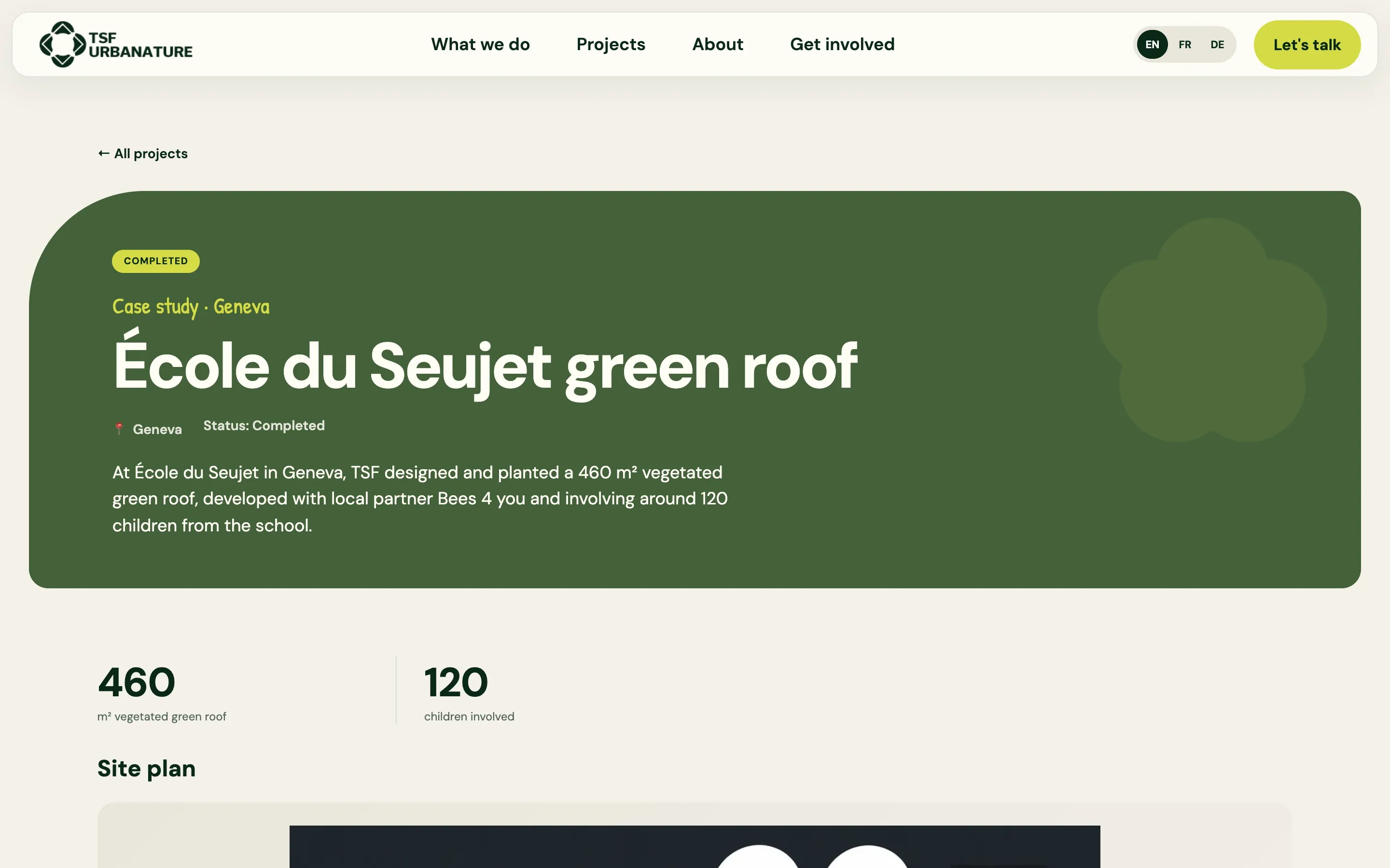
A way in for every visitor
- Before
- One “Rejoignez-nous” button for schools, councils, companies and volunteers alike.
- After
- Four routes, one for each kind of visitor: I have a space, I want to fund nature, bring my team, I want to partner. Each leads to its own page.
Before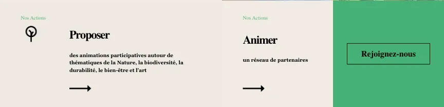 After
After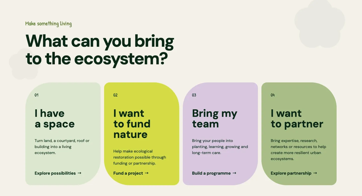
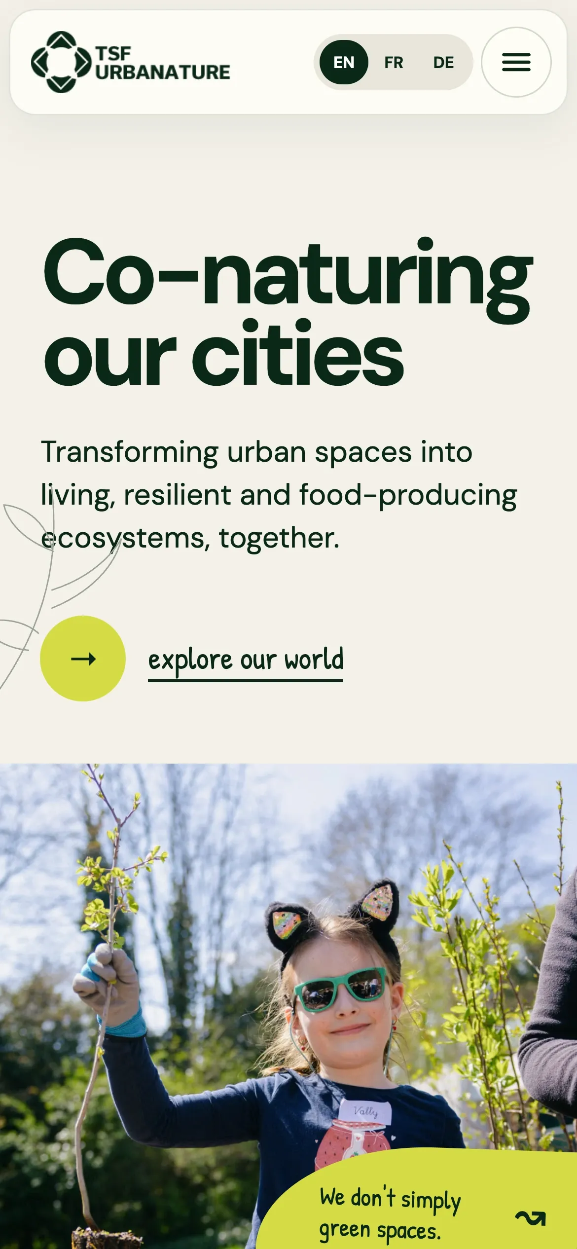
Just as clear on a small screen
Home
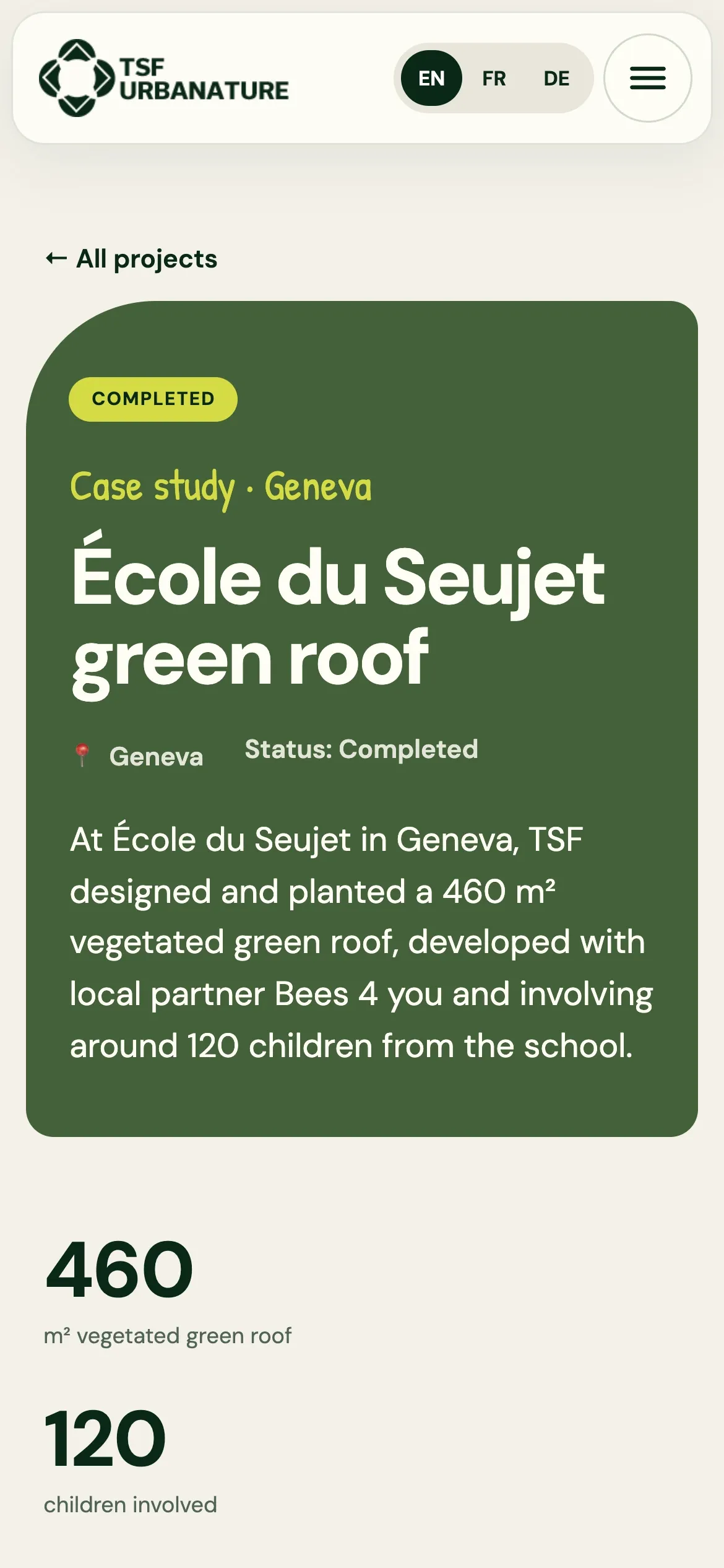
A project
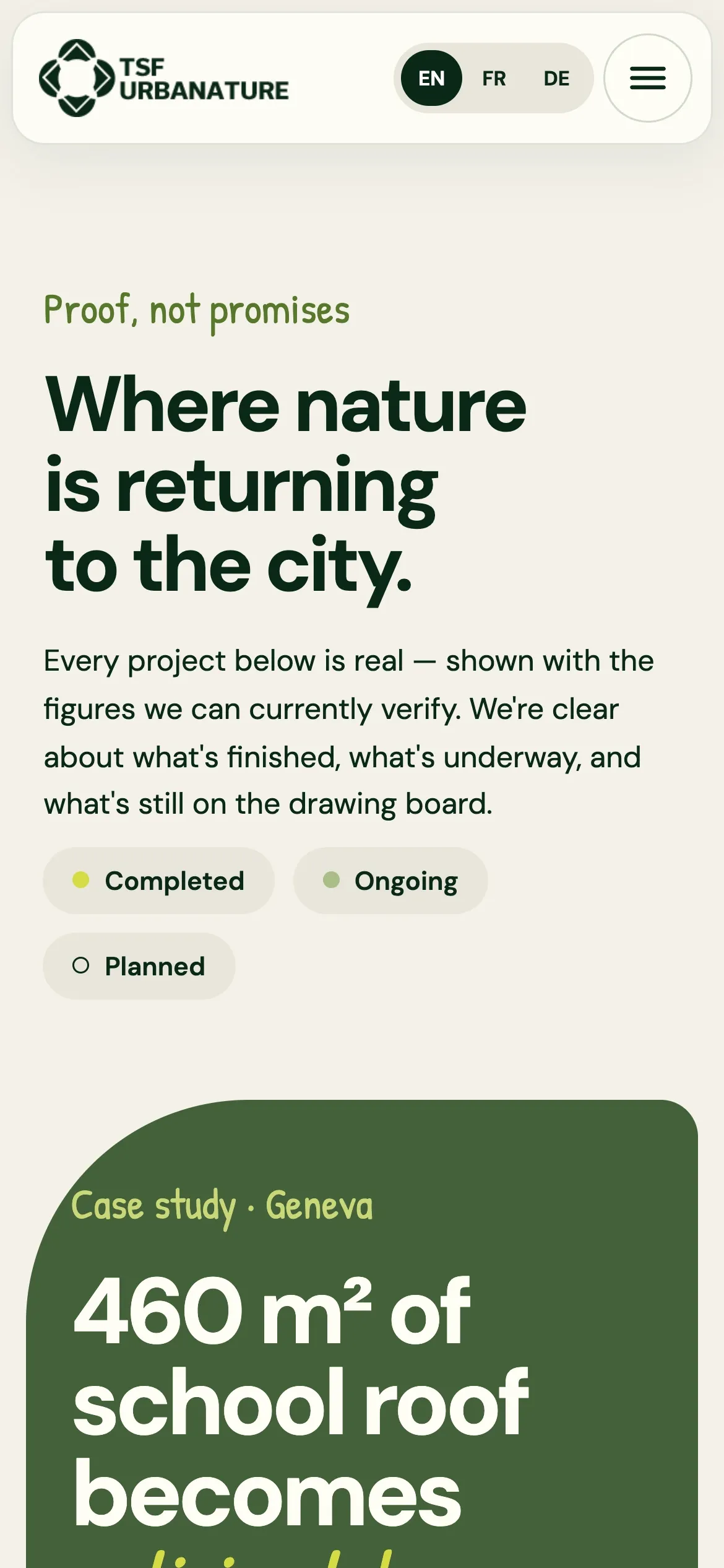
All projects
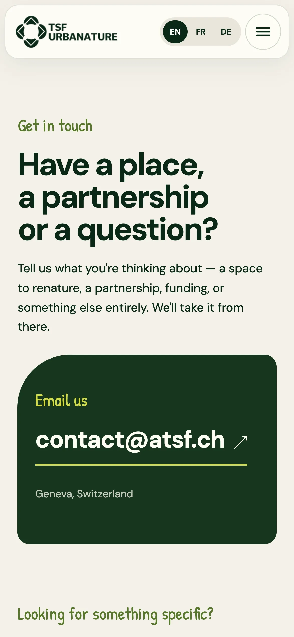
Contact
Fast, light and easy to find
- 96Performance
- 96Accessibility
- 100Best practices
- 100SEO
Lighthouse 13, desktop, run on the live homepage on 24 September 2026. Mobile performance scored 84.
Static pages, not a theme
The old homepage ran on a WordPress theme and page builder and loaded 40 script files and 21 stylesheets. The new one loads one script file and one stylesheet.
One system, three languages
French, English and German pages share the same components, so each page is written once per language, not designed three times.
Honest by design
Completed, ongoing and planned work are labelled everywhere, so the site never overstates TSF’s impact to a funder.
Built to be found
Clear headings, descriptive links, a sitemap and page titles for every project, in every language.
See it for yourself
The new atsf.ch is live in French, English and German. It leads with real photos and real projects, marks every figure as completed, ongoing or planned, and gives every kind of visitor somewhere to go next.
Testimonial: A word from TSF UrbaNature on the project will appear here once they’ve sent it.